Saturday, June 4, 2011

Advertisement Appreciation | IKEA

     Whether you are a home maker or a world renowned multi-million dollar interior designer, you all know what IKEA is.

Whether you love them or not, there is one thing that we all have to agree on: they are good at what they do and have succeeded in making themselves known to the world. If it weren't for them, not everyone would have the opportunity to live the way they want to :) Their products may not be heirloom quality; you probably won't be able to pass that sofa down to your kids and grand kids, but who cares! It gives people an opportunity to try new things, without the hefty commitment of a $15,000 sofa on their shoulders. It gives people something to eat on until they can afford their all time wish-list dining room set.

     Aside from their home furnishing products, I have to take a moment to note how amusing and fantastic their ad campaigns are. Their catalogs are so effective with all the easy "how-to" vignettes throughout. True to their design model, catering to the DIY crowds, the ads are not only up-to-date with the latest styles, but they break down what each item is, how much it is, and obviously lets you know that you can get it all from IKEA. Simple and straight forward... and so EFFECTIVE!

     What's even BETTER are their quirky advertisements, such as these...

Tackling the Mess Monster...
introducing their new line of cabinets to help organize your life.


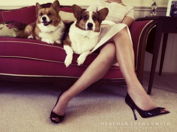
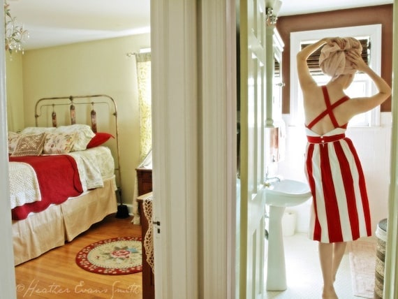
     Another great ad campaign was their "high -end fashion" campaign...


         The latest in their ad campaigns is yet again about organization. Introducing their new shoe organizer...


     Not all IKEA pieces are easy to put together - therefore introducing their installing services...

     And last but not least, an oldie, but a goodie. An ad that was developed in response to the idea that IKEA is "as cheap as it gets."


    It is refreshing to be able to see ads like these and appreciate them for their quirkiness and sense of humor about their product and company. Working on a Fall ad campaign myself, I find myself feeling stuck with the "same old thing." It's good to be able to step outside for some fresh air and see what else is out there. It gives you a chance to step back into your office with a fresh perspective on things.

...now I wouldn't necessarily go and put TIRES into my high-end luxury branding campaign (I don't feel like getting fired) but one can dream, right? ;)

Thursday, May 19, 2011

I ♥ Giveaways

I came across this giveaway and knew I had to share it with you as fast as my little fingers could type up the post!  As any designer will tell you, the window treatments in a room are just as important as all the wonderful furniture pieces adorning it.  And while good quality treatments can get pretty pricey, they are completely worth the investment - but that's for another day, another post.  

For the chance to win $2,000 worth of window treatments from The Shade Store, just fill out the entry form at Dwell before May 31st, cross your fingers, and pray to sweet baby Jesus!

And in the meantime here are some images of what they offer at The Shade Store...


Patterned Sheers with Drapery
Relaxed Roman Shades with Drapery


Panel System with Sheers

Roman Shades


Solar Shades

Monday, May 16, 2011

Travel | Uruguay

Over the weekend I happened to pick up a past issue of Conde Nast Traveler and came across a charming article about Uruguay.  And granted I'm in no physical condition to travel for about the next year, and no finincial condition to travel for about, oh lets say the next 18 years (see Baby Momma post), that didn't stop me from scheming on how to make my future Uruguayan trip happen.  Short of selling a body part.  And after reading descriptions such as, expansive breeze-swepted beaches, easy charm, and white-washed bungalows who could blame me? 

With my imaginary itinerary consisting of nothing else but escape, unwind, and relax, the next decision would be where to stay.  Lucky for me there is no shortage of chic and design minded accomodations along Uruguay's Moldonado coastline.  One of the top two places on my, where-to-stay-if-I-were-ever-in-Uruguay list, is Estancia Vik located in Jose Ignacio.

Designed by architect, Marcelo Daglio, Estancia Vik's Spanish Colonial architecture is made up of numerous white, adobe-walled courtyards with idylic reflecting pools, gardens, and poolside lounges where guests can drench in the sun.


Every space at the estancia is created by different local artisans and artists, such as Marcelo Legrand, giving each room its unique flair and design. 


And with the use of original artwork and sculptures, alongside spaces infused with natural materials, the rooms at Estancia Vik express the owners' celebration of nature, art, and architecture.


Later this week I'll post the second accomodation I wouldn't mind spending my lazy, Uruguayan afternoons at.  And with an eclectic design and use of repurposed materials, it definitely caters to the more Boho chic jetsetter.


photos via Haute OC and White Wall Magazine 

Friday, May 13, 2011

Weekend Project for Bookworms

Need something to do this weekend?  How about getting a head start on organizing all those intellectually stimulating, or deliciously guilty pleasure books collecting dust in that very nondescript bookcase in the corner?  In an age where Kindle's, ipads, and e-books are quickly becoming the go-to information source at a mind-numbing speed, there is something very tangible and nostalgic about getting your information the old fashioned way.  But old fashioned does not have to mean, well old fashioned.  Here are some ways that your books can take a more creative role in your home's decor.

I'm not a huge fan of faux anything - except faux fur - but I found a fun and quirky use of a faux fireplace at an open house for a Better Shelter home.  This could also work nicely for any niche you might have in your walls. 

via Better Shelter

You could also give your books a more decorative role on the wall in place of pictures or mirrors as in the following images.

Conceal Bookshelves by Umbra


Or for a more random composition try this bookshelves made of painted steel.


Fin by B-Line

If you're short on space and your furniture needs to do double duty, this wine bar makes curling up on the couch with a glass of wine and a good book even easier!

Sloane by Crate and Barrel

Here's a great space saving solution for displaying your cook books while keeping them off the counter, and away from potential spills.


Sticklebook Book Shelf
For those of us with a little OCD, what could be a better way to spend your weekend?


And if you're looking for a bookcase that says, random is the new square..

Opus by Sean Yoo

Monday, May 2, 2011

His & Hers

It's been a little over a year now since my husband and I got married.  And what I've learned about the first year of marriage is that its all about learning new vocabulary.  I'm as clueless about football as he is about design, so while I've been learning what cuts, offside, and free safety means, he's been learning what bolster, jacquard, and mid-century modern means.  But the biggest word we've both learned this past, mostly wonderful but definitely interesting year, is the the word - Compromise. 

And what has been one of the hardest areas to compromise for two people with very distinct opinions on personal style?   Well of course, design.  Yes, compromising on our interior design decisions has become more difficult than figuring out who's right - should I dare say me?- or wrong during one of our heated "debates."

Needless to say, since our personal lives have been the muse of our subjects here at Choco.meh, Nancy and I decided to start the "His & Hers" series.  With some simple strategies and a lot of patience and, compromise, creating spaces that appeal to both parties can lead to designs that are not only beautifully balanced, but rewarding.

In the image below, some key pieces were thoughtfully selected to create a space that both you and your significant other will be rushing home to cuddle up together in.  A comfortable sofa with masculine and strong lines was softened up with the addition of feminine touches from the floral accent on one pillow, to the sumptuous sheepskin and silk fabric on the others.  The neutral color scheme keeps it gender neutral, while the variety in textures and pop of vibrant yellow keeps it interesting and fun.


Wednesday, April 27, 2011

Tuesday, April 26, 2011

ARTWORK HUNT | Heather Evans Smith

SALE She Didn't Need A Man - 8x10 signed original fine art photograph     Is it just me, or does anyone else have the HARDEST TIME when it comes to getting artwork for their clients?! Or maybe I'm making it out to be more complicated than it should? 
     I just feel that art work is an investment and definitely a commitment. Therefore, my client should feel some sort of affinity to the artwork that they're putting in their spaces. Of course, I have a few clients that completely trust my judgment. Then again - they are usually bachelors who needs the help (haha). 
     When helping clients with artwork- I make them do "homework." I give them magazines and books with a variety of artwork and a stack of post-its. I tell them to mark what they like, what they don't like, and things that interest them but are unsure. This gives me a good starting point and a better understanding of what they like without having to schedule a full day of aimless field trips to art galleries. 
     For myself, I tend to gravitate to art work that is a little quirky and has a story to tell. I love movie still frames! Though I find there is a place for every kind of artwork, I really LOVE IT when people bring in unexpected images into a room.
     One of my favorite photographers is Heather Evans Smith! Her photography has such a great romantic haze to it. Each photograph tells a story and almost reads just like a movie. I'm waiting for the opportunity to put one of her pieces in a more traditional home setting (crossing fingers). She was a wonderful website you all should visit.  And if that's not enough, she is having a great SPRING SALE on ETSY.       


SALE In The Parlor With Mrs. S - 5x7 original fine art photograph


SALE Saturday Morning - 11x14 signed original fine art photograph


SALE Coming Home - 5x7 signed original fine art photograph
     Ultimately, art work should really speak to you. Whether it be an obvious obsession you have or it reminds you of  where/who you hope to be one day, it doesn't matter! Sure, you can buy it just because it matches your color palette, but it won't last long!  Buy artwork because when you see it - you know in your gut that you just HAVE TO HAVE IT and you can't seem to stop staring at it. 
     Finding artwork for my clients always takes time. Even if they "like" it, that's really not good enough for me. I want them to have that " WOW" look on their face; when they look at the artwork and forget that I'm still talking to them. 


Eh, maybe with time, I'll get better at picking artwork.
For now, I'll settle with tempting myself with Heather Evans Smith's Spring Sale on Etsy! 


Thursday, April 21, 2011

Markers vs. 3D Max


     I found these fashion sketches/illustrations during my hunt for a pair of patent leather pumps for work. Yes I know, random, but it reminded me of a question that was discussed quite frequently during my school years:


Which is more effective overall in the design industry: hand renderings or computer renderings?


     The most popular answer to this would be that both has its place in the industry. The common response is while loosely rendered sketches are essential in residential projects, complete 3d renderings are mandatory in commercial projects. 


kwestler
    
      One of my favorite blogs is 
A Schematic Life. Michelle does such a great job showing us that even these simple renderings give us the overall idea of what the space looks like, feels like, and yet still give us room to imagine ourselves in it. 
     In some ways, these loose renderings can communicate more information than a 3d rendering. While a 3d rendering illustrates a room/building accurately down to every inch, what it lacks is a hierarchy and the human touch in design. In the sketch to the left, though the drawing may not be accurate down to the last 1/2 inch, the proportions, color, and overall idea is still being communicated accurately. Most importantly, it shows us what the key pieces and ideas are in this setting: the green sofa, contrasted by two black wing chairs, an iconic flooring, and the same shape on the back wall mimicking the floor pattern. Whether that hierarchy is verbally communicated to our clients or not, a rendering like this one will allow them to understand that naturally. 


     What I do have to admit is that 3d drawings are just a standard now in the industry. With investors pouring millions of dollars into commercial projects, these investors demand to know what EXACTLY they are getting for their money. 
     These 3d renderings are so life-like. They show you exactly how the light will enter the windows, exactly how all elements of the room will work together. You can even set the rendering to particular times in the year and how that will affect the lighting of that specific room! 3d renderings make design possible for those that may not be the most visually geared person - and that's okay! If anything, 3d renderings helps us reach an entirely new market of clients. 
     Still, I don't feel like every commercial project has be to done in 3d. Disney, for example, makes million dollar investments on the expansion of their parks. Still,  they do all their rendering loosely as well, and go into detail for construction when needed. 


Concept drawings for the new California Disney Main Street 2012

     At the end of the day, perhaps it's not the type of project that determines the appropriate rendering technique so much as the type of CLIENT. 
     Though 3d renderings have always fascinated me, my heart is still closely attached to hand rendered drawings - for residential and commercial projects.  Loose renderings allow the mind to wander and leave room for our clients to fill in the gaps with their own imagination. It's such an important part of the design process to create a comfortable forum for our clients to give us their input- after all, it is their money and their investment. 
Related Posts Plugin for WordPress, Blogger...