Wednesday, April 27, 2011

Tuesday, April 26, 2011

ARTWORK HUNT | Heather Evans Smith

SALE She Didn't Need A Man - 8x10 signed original fine art photograph     Is it just me, or does anyone else have the HARDEST TIME when it comes to getting artwork for their clients?! Or maybe I'm making it out to be more complicated than it should? 
     I just feel that art work is an investment and definitely a commitment. Therefore, my client should feel some sort of affinity to the artwork that they're putting in their spaces. Of course, I have a few clients that completely trust my judgment. Then again - they are usually bachelors who needs the help (haha). 
     When helping clients with artwork- I make them do "homework." I give them magazines and books with a variety of artwork and a stack of post-its. I tell them to mark what they like, what they don't like, and things that interest them but are unsure. This gives me a good starting point and a better understanding of what they like without having to schedule a full day of aimless field trips to art galleries. 
     For myself, I tend to gravitate to art work that is a little quirky and has a story to tell. I love movie still frames! Though I find there is a place for every kind of artwork, I really LOVE IT when people bring in unexpected images into a room.
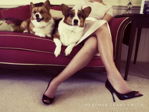
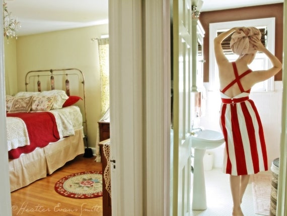
     One of my favorite photographers is Heather Evans Smith! Her photography has such a great romantic haze to it. Each photograph tells a story and almost reads just like a movie. I'm waiting for the opportunity to put one of her pieces in a more traditional home setting (crossing fingers). She was a wonderful website you all should visit.  And if that's not enough, she is having a great SPRING SALE on ETSY.       


SALE In The Parlor With Mrs. S - 5x7 original fine art photograph


SALE Saturday Morning - 11x14 signed original fine art photograph


SALE Coming Home - 5x7 signed original fine art photograph
     Ultimately, art work should really speak to you. Whether it be an obvious obsession you have or it reminds you of  where/who you hope to be one day, it doesn't matter! Sure, you can buy it just because it matches your color palette, but it won't last long!  Buy artwork because when you see it - you know in your gut that you just HAVE TO HAVE IT and you can't seem to stop staring at it. 
     Finding artwork for my clients always takes time. Even if they "like" it, that's really not good enough for me. I want them to have that " WOW" look on their face; when they look at the artwork and forget that I'm still talking to them. 


Eh, maybe with time, I'll get better at picking artwork.
For now, I'll settle with tempting myself with Heather Evans Smith's Spring Sale on Etsy! 


Thursday, April 21, 2011

Markers vs. 3D Max


     I found these fashion sketches/illustrations during my hunt for a pair of patent leather pumps for work. Yes I know, random, but it reminded me of a question that was discussed quite frequently during my school years:


Which is more effective overall in the design industry: hand renderings or computer renderings?


     The most popular answer to this would be that both has its place in the industry. The common response is while loosely rendered sketches are essential in residential projects, complete 3d renderings are mandatory in commercial projects. 


kwestler
    
      One of my favorite blogs is 
A Schematic Life. Michelle does such a great job showing us that even these simple renderings give us the overall idea of what the space looks like, feels like, and yet still give us room to imagine ourselves in it. 
     In some ways, these loose renderings can communicate more information than a 3d rendering. While a 3d rendering illustrates a room/building accurately down to every inch, what it lacks is a hierarchy and the human touch in design. In the sketch to the left, though the drawing may not be accurate down to the last 1/2 inch, the proportions, color, and overall idea is still being communicated accurately. Most importantly, it shows us what the key pieces and ideas are in this setting: the green sofa, contrasted by two black wing chairs, an iconic flooring, and the same shape on the back wall mimicking the floor pattern. Whether that hierarchy is verbally communicated to our clients or not, a rendering like this one will allow them to understand that naturally. 


     What I do have to admit is that 3d drawings are just a standard now in the industry. With investors pouring millions of dollars into commercial projects, these investors demand to know what EXACTLY they are getting for their money. 
     These 3d renderings are so life-like. They show you exactly how the light will enter the windows, exactly how all elements of the room will work together. You can even set the rendering to particular times in the year and how that will affect the lighting of that specific room! 3d renderings make design possible for those that may not be the most visually geared person - and that's okay! If anything, 3d renderings helps us reach an entirely new market of clients. 
     Still, I don't feel like every commercial project has be to done in 3d. Disney, for example, makes million dollar investments on the expansion of their parks. Still,  they do all their rendering loosely as well, and go into detail for construction when needed. 


Concept drawings for the new California Disney Main Street 2012

     At the end of the day, perhaps it's not the type of project that determines the appropriate rendering technique so much as the type of CLIENT. 
     Though 3d renderings have always fascinated me, my heart is still closely attached to hand rendered drawings - for residential and commercial projects.  Loose renderings allow the mind to wander and leave room for our clients to fill in the gaps with their own imagination. It's such an important part of the design process to create a comfortable forum for our clients to give us their input- after all, it is their money and their investment. 

Wednesday, April 20, 2011

Baby Momma

I apologize for the late introduction!  I am the second half of Choco.meh and the yin to Nancy’s yang.  My name is Sae (pronounced say) Hi Kim – I kid you not.  Like Nancy, I too have little blogging experience; however, share her passion for all things design related.   You might find our styles and point of views may differ at times, but hopefully, rather than leaving you with a hodgepodge of ideas, it will instead provide you with a balanced view of what good design can bring to your life.  After all, as that old saying goes –two creative brains are better than one!

So what does the title of this blog have anything to do with design? Being 7 months pregnant now, and with my career on a temporary hiatus, I now have two avenues in which to pour all my creative energy into--finding the most inspiring designs for you, and that little bun cooking in my oven.  So don’t be surprised if some of my blogs have to do with cute nursery décor, bumpers, pink color palettes--yes, it’s a girl!—and even the occasional layette or two.

I have to admit motherhood can be a bit disorienting.  But what makes up for the ankles turning into cankles, having to check the fridge to see if I left my keys in there, and the 1 am, 3am, and 6 am dashes to the bathroom, is that much of the conventional rules for nursery decor have gone out the window, making nursery design as much fun as it is a unique expression of you.  Blue is no longer just for boys, pink is no longer just for girls, and gender neutral colors such as orange, green, and yellows are popping up everywhere. And because I don't like being constrained to one particular style, I've collected a variety of images that have caught my eye so far.  


Saturday, April 16, 2011

Weekend Kick Off with Fashion & Balloons

To kick off the weekend... lets enjoy some eye candy! 

    Photographer Luis Monteiro is a personal favorite. His work is always reads "effortless", but there is always some element of quirkiness to them. 


    This editorial was done for Tatler UK. I'm not sure what it is about this series of images, but I think they are perfect for this weekend. Have a wonderful weekend. And if all else false, go to Production Paradise and get your daily dose of inspiration from all the great editorials on there!


Friday, April 15, 2011

Campion Platt | Made to Order Book Signing Event

    I've been to so many book signing events, but this is the FIRST TIME I have ever felt so compelled to actually BUY the book. And if that wasn't enough, I got greedy and got the book SIGNED!!! I got a chance to meet Campion Platt at his book signing event at Rose Tarlow on Melrose. (the showroom looked GREAT by the way)

Made to Order, is such a great representation of the wide range of projects Campion Platt has worked on in the last 20 years. The book is a wonderful compilation of projects that range from a country manor, a tropical  retreat, to a New York Fifth Avenue art house. 

My favorite part of this book are the short personal essays. Of all the personal essays, my favorite is the one  about " Telling A Story."

    "If you have developed a strong concept, you will make fewer mistakes, create interiors that are more original, imaginative, and authentically your own -- and you will be practicing the craft of interior design rather than simply decorating... if your theme does not seem to be working after a few tries, don't be afraid to move on. There is a Buddhist saying: " The only way out is in." Immerse yourself in the process -- and you will come out with the right story to tell. " 

This book should be a staple in our design libraries. Though the pages are filled with amazing professional photographs of effortless interiors, it isn't the photographs that make this book a MUST. The most impressive parts are the candid confessions of a great designer that isn't afraid to admit that design is not always perfect -- that design is beautiful because of the story we tell and the process we go through to tell it. 


For more information, visit Campion Platt's website


Wednesday, April 13, 2011

First Name: Nancy | Last Name: Quynh

FOR THE RECORD: Blogging may come natural to some. For me, what ends up happening is just major "blogging - vomit" (haha). I just have so many things to tell you and it just comes all at once! Still, I promise I will try my best to share one thing at a time. 
So if I do commit minor "blogging - vomit" please understand that I am probably just over excited.  :D

Tid-bits about myself...

My name is Nancy Quynh. I make up exactly 1/2 of CHOCO.MEH. I received my BA in Interior Architecture and Design from the Academy of Art University, San Francisco. This is also where I met CHOCO.MEH's other half... Sae Kim. Together we conquered  project after project. Through those projects, we found that we made a great team and still do to this day. 

My current 9-5 job is being the Marketing Manager for a high-end luxury furniture company in West Hollywood. It's been a roller coaster ride but a great one. I have been blessed with great opportunities, even in this economy and I couldn't ask for more. 

I spend my evenings and weekends  either working on design projects for my own clients, watching my daily dose of TV, or finishing up the last Harry Potter book. Hate to say it, but I am also a HUGE AMERICAN IDOL fan, and would live at Disneyland if Mickey would let me. <3

I really just want CHOCO.MEH to be a place where Sae and I can get together and share our adventures with you all.  In hard times, it's difficult to remember what fuels your passions and aspirations and I hope that CHOCO.MEH, along with all the other great blogs , can inspire you to keep going for what you want in life

.... because I know I will be. 


Related Posts Plugin for WordPress, Blogger...